Overview
This week, I focused on creating data visualizations. Since data visualization Daily Creates are not available on the Today’s Daily Create (TDC) website, I had to think of ideas for creating data visualizations myself. First, I created a pie chart on Canva showing the percentages of family’s favourite colours (the % of 7 people who have a certain favourite colour). Later on, I created a bar chart on the temperature in Kelowna compared to the temperature in Victoria, British Columbia.
Daily Creates
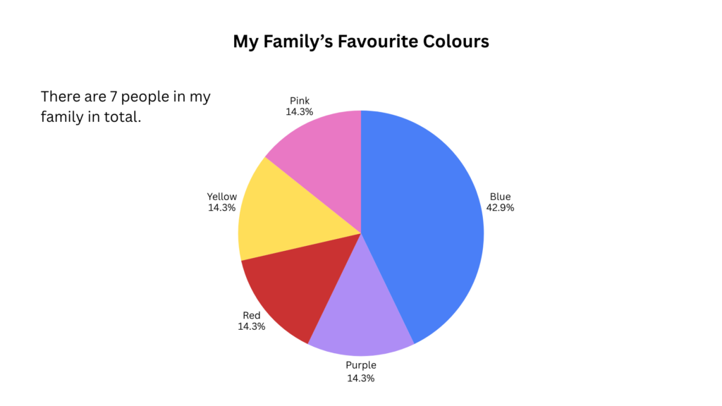
Canva Pie Chart on My Family’s Favourite Colours
For this Daily Create, I decided to create a pie chart using Canva on my family’s favourite colours. There are seven people in my family, including my parents, my three siblings, and my partner (who I included so there would be more people involved for more data). As can be seen from the pie chart, 3 out of 7 (42.9%) people in my family favour the colour blue, 1 out of 7 (14.3%) favours the colour purple, 1 out of 7 (14.3%) favours the colour red, and another 1 out of 7 (14.3%) has the favourite colour red.
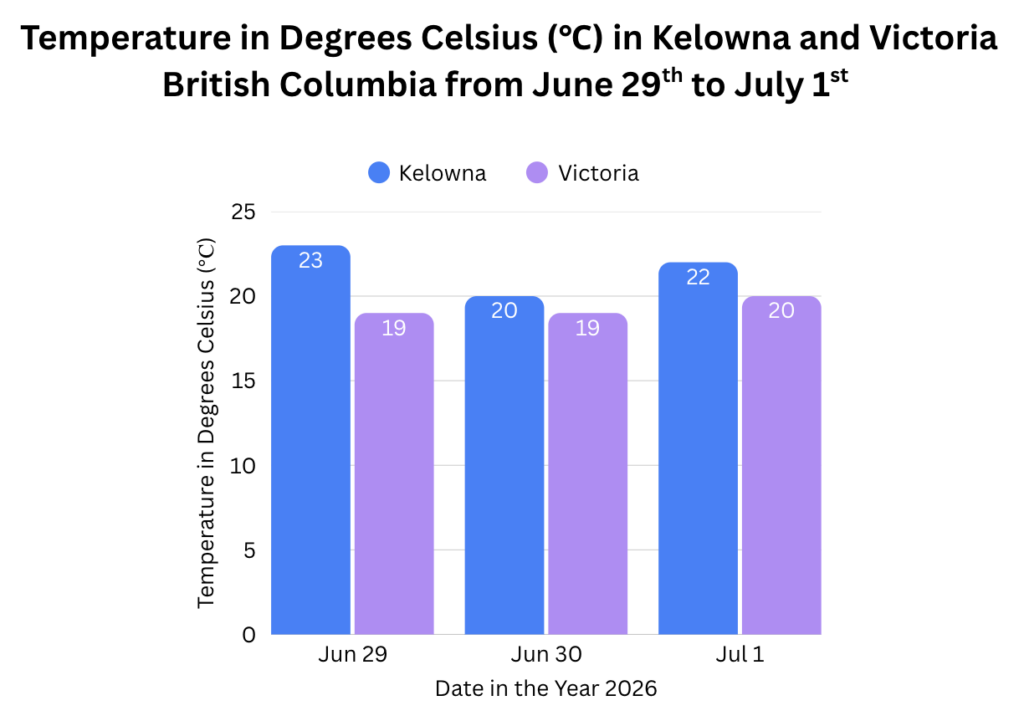
Canva Bar Chart on Temperature in Kelowna vs. Victoria
In this next Daily Create, I decided to create a bar chart on Canva to show the temperature in degrees Celsius (℃) in Kelowna and Victoria, British Columbia from June 29th to July 1st. Sometimes I like to compare the weather between where I live in Kelowna and where my family lives in Victoria. I wanted to know what the weather might be like anyways as I plan to go out between those dates. It’s interesting to see how as it gets cooler here between the 29th and the 1st, it gets warmer in Victoria. I used the Apple Weather app on my phone to get this data.
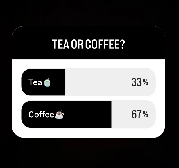
Instagram Poll on Preference for Tea or Coffee
For the final Daily Create this week, I posted an Instagram poll on my Instagram story and set it for only friends to see. I asked a few of my friends to fill out the poll. The Instagram poll idea is something I saw another classmate do, so I thought I would try it out myself. The poll asks a simple question of whether my friends prefer tea or coffee. Three of my friends answered the poll. Two out of three (67%) prefer coffee, while one person prefers tea (33%).
Reflection
This week, I used two different platforms and three different ways to represent/visualize data. This reflected several course concepts, including the data visualization principles. Overall, I think my Daily creates help to show patterns and ideas that may be harder to grasp without the use of data visualization.
Across each of my Daily Creates, I used the data visualization principle of keeping it simple. This principle states that I should avoid making highly elaborate and complicated charts and that I should use common charts that people are familiar with (Madland, 2026). Additionally, it states that I should avoid using 3D charts as they can distort the image and how the user perceives the data (Madland, 2026). For the first two Daily Creates, I used common charts like pie charts and bar charts. Across all of my Daily Creates I used simple colours and smaller datasets to make it easier to visualize and understand.
I made sure to use appropriate data visualizations for each of my Daily Creates. This aligns with the data visualization principle outlined by Madland (2026), which explains that one should use visualizations that are appropriate for the type of data that is being shown. I used a pie chart to show the percentage of people in my family who favour a certain colour out of multiple colours. And I chose to use a bar chart with proper colour coding to show a comparison between temperatures in Victoria and temperatures in Kelowna. The bar chart can also show a pattern on whether the temperature is increasing or decreasing in each location. Finally, the Instagram poll was used both for the collection of data from peers and for visualization as it shows a simple question asking for my friends’ preference for tea or coffee. It also shows the percentage of those who answered “tea” and those who answered “coffee”. Using two comparison bars (one for “tea” and one for “coffee”, the bars fill up to visually show which option was chosen more.
For each of my Daily Creates, I labeled axes and data visualizations clearly so that viewers could easily understand what is being presented. This aligns with the principle to label clearly (Madland, 2026). For example, in the bar chart, I labelled the y-axis as “Temperature in Degrees Celsius (℃)”, making sure to show the units, and I labelled the x-axis as “Date in the Year 2026” to specify the year. I also labelled the data bars with numbers to specify the exact temperature represented by each bar. Finally, I used colour coding labels to specify which colour belongs to which city (Kelowna or Victoria).
For the pie chart, I made sure to use colour intentionally. I made sure to use different colours that are easy to distinguish between each other, without making use of too many colours. This aligns with the principle that states colour should be used to highlight important data and make data visualization appealing, while also not being overwhelming with too many colours or inconsistencies (Madland, 2026). I matched the colour on the pie chart to the colour mentioned in the data labels to make it clearer and more consistent for those viewing it.
Finally, across all of my Daily Creates, I provided context and told a story through text associated with the data visualizations. In my bar chart and Instagram poll, I clearly stated where I got the data source from (Apple Weather and Instagram apps). I also provided context for the data in each of my charts with information like units of measurement, including percentages and degrees Celsius. This aligns with the principle to “provide context for the data by including relevant information such as units of measurement and a description of the data source” (Madland, 2026). Moreover, I told a story to communicate a message in my bar chart Daily Create, sharing how I like to compare the weather between my city and my family’s city and how I wanted to check the weather in Kelowna so I may go out between those dates. For each of my Daily Creates, I use titles for my data to provide the key takeaways. This shows that I used the data visualization principle to tell a story, which means to communicate a message and use titles to explain key takeaways regarding the data (Madland, 2026).
References
Madland, C. (2026, June 15). Week 6a – June 15. EDCI337 Mirror Site. https://cmadland.github.io/edci337/posts/jun-15/








Recent Comments